Avoid costly custom t-shirt design mistakes with our expert guide covering resolution, file types, and placement tips.
Share:
Summary:
The foundation of any great custom t-shirt Long Island starts with your image quality. Yet this is where most people stumble right out of the gate.
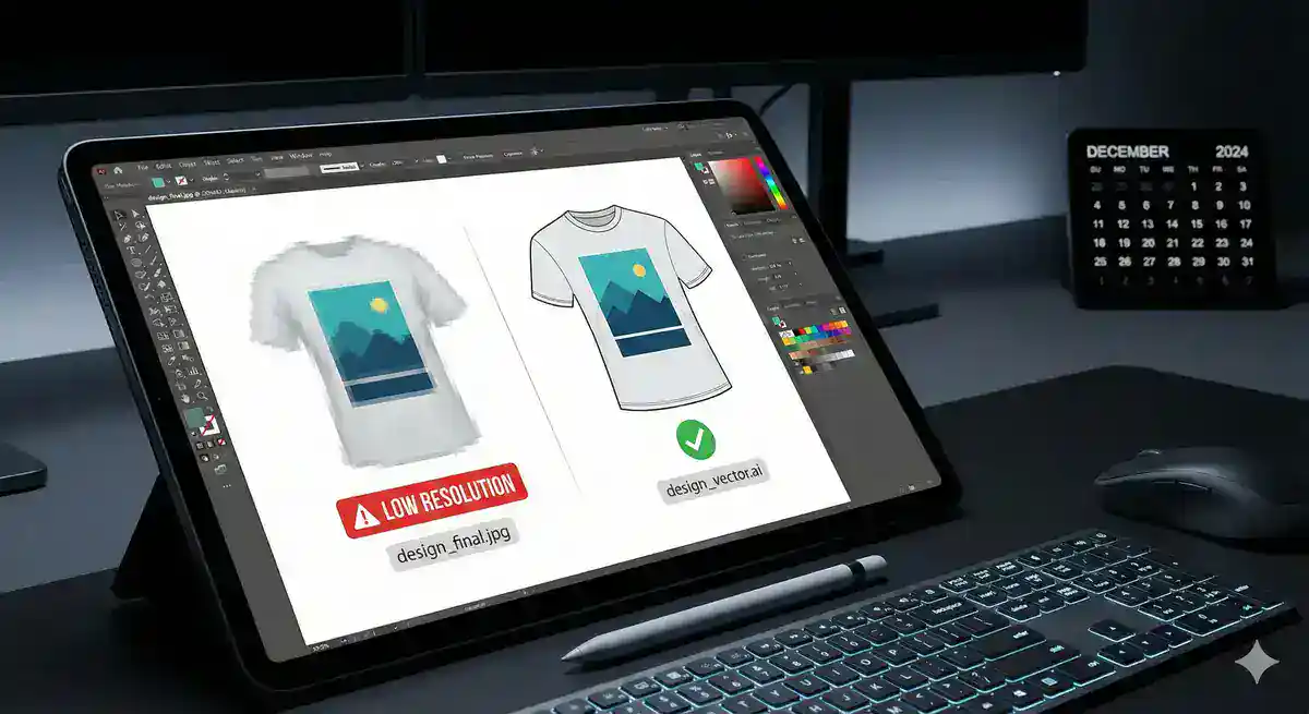
You need images with at least 300 DPI to avoid blurry prints, and it’s crucial to use large, high-resolution raster images for your print projects. Think of it this way—your computer screen can make a low-resolution image look decent, but printing exposes every flaw.
Raster images from the web are generally not suitable for print reproduction as they are often saved as low-resolution images, though you can purchase high resolution raster images from companies such as Adobe Stock or iStock that will work fine for many print projects.
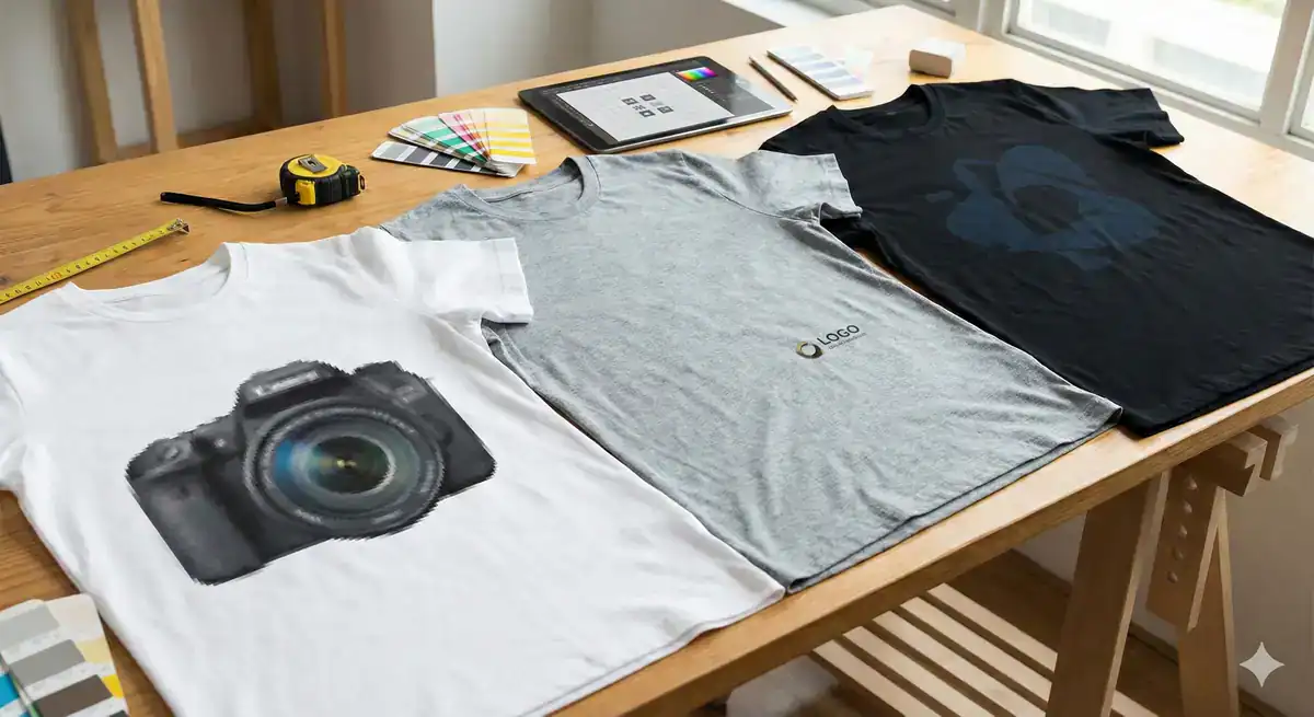
Here’s what happens when you ignore the 300 DPI rule. Pixels are measured by dots per inch (DPI) in the print industry, and the higher your DPI, the sharper your image will appear, while lower DPI leads to pixelation where you can see the edge of each pixel resulting in a ‘blurry’ looking image.
Most images you find online are optimized for screens at 72 DPI. Web images use 72 DPI while print needs 300 DPI, and a 72 DPI web image looks terrible on paper. When you try to print these low-resolution files, the printer has to stretch those pixels to fill the space, creating that fuzzy, unprofessional look nobody wants.
It’s easier to bring a raster image down in DPI rather than making a small image larger or higher resolution, as doing so will distort the image. This means starting with high-quality source material is non-negotiable. You can’t enhance a blurry photo after the fact—the detail simply isn’t there.
The solution is straightforward but requires planning ahead. If you’re using a raster file, aim for at least 300 DPI at full print size to ensure your design stays crisp and clear, whether it’s on a pocket tee or a back print. Professional designers always work at print resolution from day one, and you should too.
Understanding file types can save you from resolution headaches entirely. Raster images are made of pixels and limited by their resolution, while vector images originate in math, made of points connected by paths and curves generated via mathematical equations, allowing you to scale up or down with no loss of image quality, keeping everything crisp and in the right proportions.
The short answer for what type of image file is best for printing—vector files. For DTF transfers, vector files are usually the best option as they provide sharp, clean edges that make designs pop on fabric. Think logos, text, and illustrations with clean lines.
But vectors aren’t always the answer. High-resolution raster files can also work well, especially for complex photographic images or designs with subtle gradients and textures. The key is matching your file type to your design needs.
You can identify file types easily: JPG, PNG, BMP are raster while SVG, AI, EPS are vector. One way you can check is by zooming in on the image—if you notice pixels, then you have a raster file, if everything stays crisp, then that would be a vector file.
When working with us, our team can help you determine the best file format for your specific project. We’ll review your artwork and recommend whether to proceed with your current files or convert them for optimal print quality.
Want live answers?
Connect with a L1 Print expert for fast, friendly support.
Even perfect artwork can look amateur when placed incorrectly or printed in the wrong colors. These visual elements make the difference between professional-looking custom apparel and obvious mistakes.
Many people new to t-shirt design don’t know that a standard full front placement isn’t halfway between the shirt’s top and bottom—it’s actually around 4″ from the collar, so a common mistake is the belly print, and it’s never flattering.
Color choices create similar pitfalls that catch beginners off guard.
Getting the placement right is what separates professional t-shirt designs from amateur-looking ones, with frequent mistakes being misalignment or using the wrong design size for different garment variations, and it’s crucial to factor in age-specific requirements, especially for children’s clothing.
The “belly print” problem happens because people assume centered means mathematically centered. Placement normally gets centered based on the midpoint, but not all designs should. Your eye naturally expects designs to sit higher on the chest area, not at your midsection.
Keep important details centered and avoid designs too close to the edges, test how it looks under a hoodie or jacket to ensure the main part stays visible, and avoid super large, awkwardly placed graphics that get cut off when layered. This layering consideration is especially important for team apparel or event shirts where people might wear jackets.
Size matters just as much as position. There may be things in life where size doesn’t matter, but a t-shirt design is not one of them, and a common mistake is people setting their design to standard size, but standard is close to the maximum, which can be too large for most designs—the size should be based on the purpose of the shirt, the properties of the garment, and the characteristics of the design itself, with certain shapes like circles and squares looking better when sized smaller than standard.
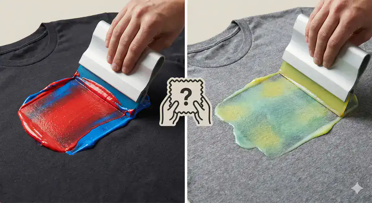
Typical contrast mistakes include navy on black shirts, light gray ink on sport gray shirts, and ice gray ink on white shirts—these are low contrast combinations that aren’t recommended. Your design might look great on your computer screen, but printing requires much stronger contrast to remain visible and impactful.
Screen printing uses plastisol inks that are thicker, more viscous, and opaque, creating a pronounced base on the garment, while digital printers commonly use water-based inks that, although vibrant, have semi-transparency on darker backgrounds making them look dull. This means your color choices need to account for your printing method.
More colors mean more complicated printing, and complicated printing often means more costs, depending on the method of printing you’re using. Each color in screen printing requires a separate screen, meaning multiple screens are needed for multicolored designs, and the screen printing setup process is time-consuming as a separate screen needs to be prepared for each color, but once screens are created, the printing process is fast and efficient, making bulk orders more cost-effective.
Screen printing produces vibrant, durable designs with more saturated colors than DTG, but the labor-intensive process of turning your design into multiple stencils limits the number of colors you can use, while DTG printing produces a slightly more faded design with a single layer of ink but with no limits on the number of colors you can use.
Understanding these trade-offs helps you make smarter design decisions upfront. We offer both DTG and screen printing options, and our team can guide you toward the method that best suits your specific design and budget requirements.
The difference between disappointing custom apparel and professional results comes down to understanding these seven critical design elements. Want to be 100% sure your shirt is right before you print 500? Order a sample—it’s the ultimate way to catch issues with fit, print, and feel.
Smart designers always start with high-resolution files, choose the right format for their artwork, plan proper placement, and consider how colors will translate to their chosen printing method. These fundamentals prevent the most common disasters that lead to wasted time and money.
Ordering a gazillion t-shirts without a test run is like buying shoes online without checking the size guide—always order samples first to assess the fit, feel, and look, as this step could save you from a fashion disaster. This is exactly why we strongly recommend ordering a single test print, leveraging our no minimum DTG service, to verify your design before committing to a bulk order.
Continue learning: